“Not long ago, serif and sans had their own background; they were almost considered ‘enemies,’ unable to work together on paper, or at least not without difficulty. With Questa, we demonstrate that when deriving the sans version from the serif version, they will mix seamlessly.”—Martin Majoor
Martin Majoor + Jos Buivenga: Type Designers, Questa Project / Arnhem, NL
thequestaproject.com
exljbris.com
martinmajoor.com
“not long ago, serif and sans had their own background; they were almost considered ‘enemies,’ unable to work together on paper, or at least not without difficulty. with questa, we demonstrate that when deriving the sans version from the serif version, they will mix seamlessly.”—martin majoor
How do your backgrounds mesh together?
We have a common background in our art education, attending the same school in Arnhem in the 1980s, and occasionally meeting. After graduating, we went our own way and didn’t meet again for about 25 years.
When it comes to type design, Jos is self-educated. He worked in advertising, but he admired the type designers he knew from Arnhem, like Evert Bloemsma, Fred Smeijers, and myself. Eventually, he started designing his own typefaces. I had the opportunity to study type design and turn it into my thesis project. I worked as a book typographer and type designer after graduating.
Since we started collaborating, our technical skills and aesthetic insights have balanced, but we still learn a lot from each other.
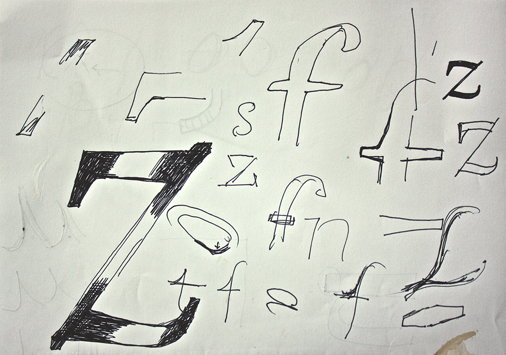
Questa Sketches
courtesy of majoor + buivenga
How do you work together?
When we started The Questa Project back in 2009, we both lived in Arnhem within a stone’s throw of each other. It was very important to get together in the same physical space, especially in the first few months of brainstorming, sketching, and printing. I regularly traveled to Warsaw, so we started working remotely through Skype’s desktop sharing option. It was not the ideal situation for collaborating, but we made it work. Meanwhile, Jos has moved away from Arnhem, but we see each other almost weekly in his well-equipped studio.
What prompted you to start working together after the 33pt. Symposium in Dortmund?
Both Jos and I gave a talk about our own work at the symposium. We were surprised to see each other during the event, since it had been 25 years. Back home in Arnhem, we showed our work to each other and experienced a good type chemistry. Talking about collaborating felt quite logical, and after a few beers, we decided to give it a go.
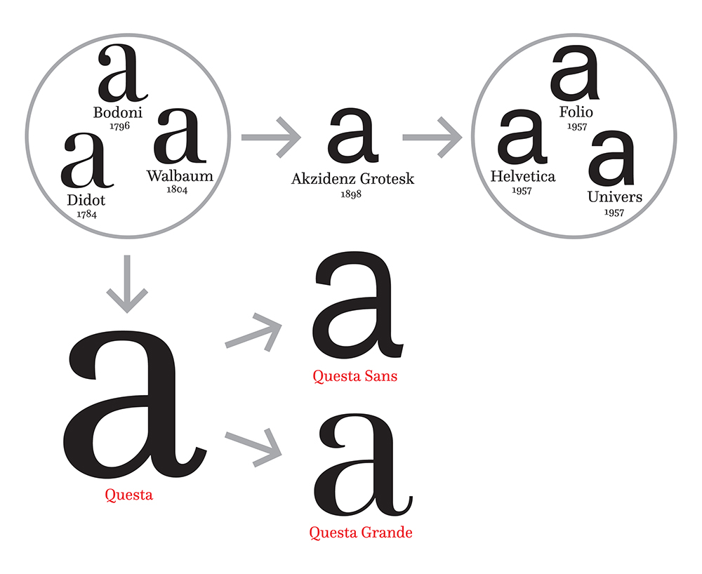
Questa Scheme Outline
courtesy of majoor + buivenga
How do you hammer out details when working on Questa?
We differ in our approaches. Jos once put it like this: “Martin tends to be more experimental and I am more likely to be satisfied with traditional solutions.” When it comes to marketing, Jos has a lot of experience, whereas I know more about the history of type design. All of these aspects help us make the best possible decisions in our collaborative process. We sometimes split production work, but we solve everything concerning the design process together.
How has technology influenced typeface design collaboration?
If you look at the metal type era, the type designer was one part of a whole machinery of people involved, from technical to marketing to transport. This machinery has dwindled in the digital era. In the 1990s, it was almost possible for a designer to handle everything alone, including world-wide distribution. But since the introduction of OpenType, it has again become more complicated to work as a lone type designer.

Questa Tests
courtesy of majoor + buivenga
There is a clear difference between designing a typeface and producing it. The design of a typeface is usually done by one person, but production usually requires several people to handle kerning, hinting, and distribution. Still, it is quite rare to see two type designers collaborating like Jos and I are doing with Questa. You need to have a certain flexibility, and you must be able to make compromises. Technology doesn’t influence any of our design decisions.
How is mixing sans and serifs like a collaborative metaphor?
Not long ago, serif and sans had their own background; they were almost considered “enemies,” unable to work together on paper, or at least not without difficulty.

The Questa Project Poster
courtesy of majoor + buivenga
With Questa, we demonstrate that when deriving the sans version from the serif version, they will mix seamlessly. At the same time, both serif and sans are keeping their own identity without being competitors. Extending the metaphor, Jos and I have a common background and collaborate closely, but we always keep our own identities.