“That is the hard part about doing everything on your own: you can get locked into something, and you can go down a road for too long before you realize it is a bad idea.”—Tal Leming
Tal Leming: Founder of Type Supply + Former House Industries Type Designer / Baltimore MD
typesupply.com
“that is the hard part about doing everything on your own: you can get locked into something, and you can go down a road for too long before you realize it is a bad idea.”—tal leming
What is the design process for a typeface?
There are two ways that I do things. I may have a client come to me and they will have a particular project that requires a typeface. In that case, they will have a specific design brief. For example, I just did one for a sports retailer here, and they wanted a typeface for an identity redesign, and they had some very specific visual requirements for it. Sometimes it is a little more open-ended, and the client says they need a new typeface, and I go from there. Mostly, I create typefaces for myself to sell via my website to designers. It’s hard to say where they come from. I usually look at particular design problems that I’ve had, but there are many typefaces out there now, and I don’t like making things that already exist, so I spend a lot of time asking myself why something should exist before I even start drawing anything, which is a very existential question. Those things are in my head for a long time, sometimes years. Eventually, I just draw them. That can go really fast, but usually it goes very slowly. On that stuff, I am often by myself, which is a hindrance.
Why do you say it is a hindrance?
I used to be a graphic designer, and that process has a faster feedback system. There is usually a problem to solve. Typefaces are more abstract, especially without a client involved. It is like making a new kind of hammer: “Will anybody use it?” is always the big question. Without someone to bounce things off of, I second-guess myself all of the time. That sounds very sad and pathetic. It’s just different because I have worked with people, and I have worked with a more traditional art director and designer relationship, where there is one designer leading the project, and in that kind of scenario, answers to things can come faster. I don’t have a lot of self-doubt, because that sounds really depressing, but I do spin a lot, because I am a perfectionist. When you are a perfectionist, the answers to ambiguous questions are hard to find, because there is no perfect answer. I swear I am not crazy.

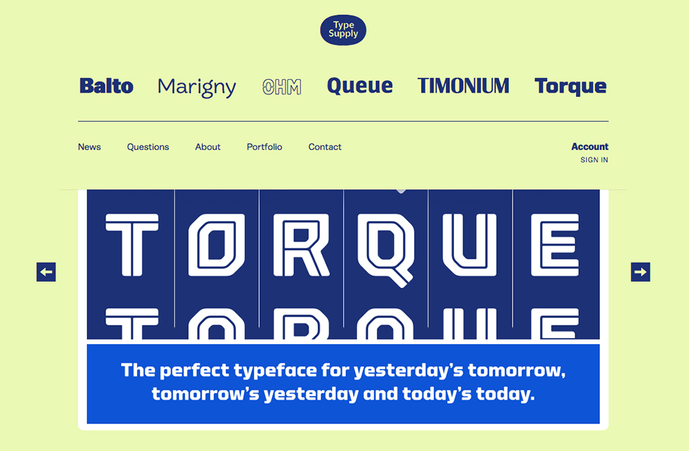
Torque
courtesy of type supply
What steps do you go through when making a typeface?
I tend to ask questions in the beginning. I have notebooks dedicated to particular typefaces that I want to make because I will have ideas for something for two or three weeks at a time, and then I will drop it, and pick it back up a year later. I don’t let myself draw in the beginning, because it usually falls into everything looking the same. If I go straight to drawing, it looks like whatever I did last time. Most of the time it is just questions. The very first page of the notebook says, “Why does this even need to exist?” Once I feel like I have an answer to that, I start to define what I want the typeface to feel like. At this point in my career, the aesthetics are the easy part. It is the personality that is the tricky part. Then I write a list of words, and they often contradict each other because I was in school in the ’90s and contradiction was everything that we thought about then. I am trying to make my next typeface look very technical but not engineered. Those are two fundamentally opposing things and I try to evolve it. Then I start drawing pretty small. I do a lot of sketching. It’s weird, I either do a lot of sketching, or I do none. It depends on how long the typeface has been in my head. I did one typeface called Balto, and that one was in my head for almost a decade before I actually drew anything. I didn’t sketch anything on that because I had a picture of it in my head for so long. I sketch either on paper or on my iPad. Once I feel like I know what it is going to look like, I move to drawing it with beziers in RoboFont. The reason why I stop sketching is because there is only so much fidelity from using a pencil. I don’t like to linger too long on sketches. I like to go completely digital from then on. Then it is just a matter of drawing and tweaking and drawing and tweaking and drawing and tweaking for a very long time. There is this weird moment, and I have heard other type designers say this too, when you start looking at proofs of your typeface, and you start noticing that it is your typeface, and you can start reading the words. It is a strange second when you realize that you didn’t pay attention to what it looked like, and that you were just reading it. That is when it is done from an aesthetic standpoint. It is mostly mechanical stuff after that: finishing anything that remains to be drawn, kerning to adjust the pair positions, and even more technical stuff like getting it ready for web.
How is this process different from when you were working in a group environment?
I was at House Industries; House is basically all collaboration. It is a really amazing environment because there are experts in particular things. Ken Barber is, in my opinion, the best letterer in America, if not the world. Chris Gardner is an illustrator, and he’s phenomenally good. Andy Cruz is an exceptional art director, a catalyst for everything. He is good at finding what it is that somebody does best and then directing all of that into one thing.
Torque
courtesy of type supply
I was a graphic designer there, and I designed the catalogs. Ken oversaw typeface development. I designed some typefaces at House, but most of the time I was doing graphic design because I am obsessive compulsive about that stuff. It was a really interesting place because of people like Ken and Chris, who are just better than you could ever imagine at what it is that they do. I remember I was designing a catalog for Neutraface, and I wanted a fake magazine cover to illustrate how the typeface could work in headlines on the cover of a magazine. I looked over at Chris, and I told him I needed a black-and-white drawing of a profile of a young woman in a 1930s American fashion magazine style. He sat there for two or three hours staring down at his paper and not moving. The whole time I was just designing the catalog and working and then I finally heard him pick up his pencil and scratch away. Then he handed me this thing. He said, “Is this what you’re looking for?” And I said, “Yes Chris, that’s perfect.” It was this amazing thing, but if we didn’t have that proximity, if we didn’t have that relationship, and if we didn’t have Andy pushing us all to focus on what it was that we did best and not what we would struggle to do, it wouldn’t have worked. On my own, I wouldn’t have thought of that perfect illustration in that space in that perfect style, colored perfectly, because I never would have been able to execute it.
Ken was working on typefaces based on some old photo-lettering alphabets by Ed Benguiat. Ken was drawing these typefaces; one in particular had all of these interlocking ligatures, really crazy looking. Open Type was a new format at the time, and you could program it to do particular things. I had started writing code just to help with the type design stuff, and then Ken started showing me what he wanted it to do, and how he wanted the typeface to work. We tried the common way of programming ligatures, but it wasn’t looking right. I rethought the technical side, and he thought about it from a lettering side, and we sort of met in the middle—figuring out what Ed did when he drew that typeface and how he was positioning things together. We looked for the underlying pattern to solve the tech. There is a sort of up down up down up down thing that happens with ligatures when they look best. I figured out how to turn that pattern into code. Then Ken added 1,400 ligatures to the font, and it just worked. It looks remarkably similar to Ed’s original lettering.
Ken and I collaborated a lot because he would come up with these crazy ideas of what he wanted a typeface to do, and then I would figure out how to make it happen. It was a real back-and-forth process of him saying, “I want to do this.” I would think about it and say, “We can’t do that, but we can do this.” He would say, “What if we used that bit of technology to do this one little thing?” He was thinking about things from a purely aesthetic point of view and what he wanted it to look like, and I figured out what was possible. We tried to translate this primitive part of Ken’s brain into code. For the typeface Swing, we figured out that if there is a big letter, then a medium-sized letter needs to happen, or a small-sized letter, but then we ran into a bunch of walls. Technology couldn’t do some things, so he and I would have to figure out ways around it. Ben was a big part of that too, because he would have to corral what Ken was drawing—because Ken was drawing too much stuff—then translate it to me and then translate it back to Ken. So there was a lot of back-and-forth on that.
I really miss working with Ken and Ben.
Why?
Type design is a really insulated process and we all talk about this. I think there are more type designers now than at any other point in history, but we all pretty much know each other. We talk about how we end up living in our head the whole time.
Being a type designer is different from being a graphic designer. Our job is to be felt and never seen. People pick typefaces based on the impression, or the personality, that they lend to a piece of text. But you never want the typeface to be so visible that it obscures that message. We have to make the typefaces interesting enough that they are new and reflect modern times, but not so much that anybody actually ever notices them. I am not a modernist in the old sense that design has to be completely transparent, but I do think that there is something to that. The typeface needs to do its job and nothing more.
How do you make sure that happens?
Ask a lot of questions, do things over a bunch of times, and have a lot of self-doubt. That is the hard part about doing everything on your own: You can get locked into something, and you can go down a road for too long before you realize it is a bad idea.
In type design, collaboration is a really tricky thing. Christian Schwartz and Paul Barnes are probably the best at it. They managed to make typefaces that I don’t think they’d be able to make individually. That is the thing about type design: somebody needs to be in charge of it, because there needs to be a singular voice. If there’s going to be more than one person involved, then everyone needs to find a common voice.
Do you run collaborative projects when you teach at MICA?
Usually everyone is trying to make their own typefaces. Type design takes a long time to get a handle on. I have been doing it for 20 years. I feel like I am only just now getting to the point where I know what I am doing. There are so many little details to it all, and when I teach, I have to get them up to speed very fast. I keep them from getting frustrated in the beginning by throwing them to the lion. In that process, I really reinforce that they talk to each other, and show each other what they are doing, because someone may figure something out. It started to happen towards the end of the year. Some of the students’ typefaces were major parts of their thesis, and I know that they shared things that I worked on with them individually. One student made a typeface with more ligatures than can ever be drawn. He’s crazy. So I helped him write the code for that. Then he took that code and showed it to somebody else, who then adapted it, and this code went around and was used for different things for different people. That was really cool to see them starting to take those lessons and teach them to each other.
Do you bounce process work off of people?
I am very secretive. Unless I am working for a client, I am really slow. It is because I ask a lot of questions, and I am a relentless perfectionist, so that makes me go slow. I did a typeface in two months, which astonished my friends, but I deliberately tried to work with a short deadline. I have a few friends who I show things to. I feel like I am a burden to them by doing that, because they are all doing their jobs, and I am really old-fashioned and weird. I am secretive because there are many people doing type design now, and it takes me a long time to draw things, so I don’t show anything publicly until it is done. I am like Apple that way: it appears out of nowhere.
Are contemporary usages of typography, in video for example, making type design itself interdisciplinary?
Most type designers are not involved in that yet. We have been doing this for 500 years, and it is largely unchanged. The tools that we use to produce typefaces have changed, but the fundamental principle of type is exactly the same on the computer as it was when Gutenberg came up with it, or China, or Korea. It is very similar. We are very skeptical of motion. I embrace technology quickly. I have been involved in Web standards for type design. There is a proposal out there for the most radical thing that we are thinking about right now, which is that typefaces could have multiple colors in them. There is a technical specification that is in the works for that right now. Type design, in the last five years, has gone through some substantial changes as a result of web fonts. We still make what we did before, but making things to work on screen has significantly more complexity to it. We all have to cope with that. We’re still trying to figure it out. It is expensive and time-consuming, and we don’t know if there is going to be any return on it.
Does everyone interested in type design need those dual bodies of knowledge?
Yeah. That is what I tell my students, and they sometimes argue with me. It’s funny, I stood up in front of the class in the beginning and I said, “You’re going to have to learn code,” and one student audibly said, “No!” What’s funny is, his typeface was the one with the most code in it. His relied on code more than anybody else’s to do what it was that he wanted it to do. I think that design and programming is all starting to come together. The designer would give flat designs, and the programmer would execute them. Those roles are merging, but they are merging toward the side of the designer, not to the side of the programmer. Designers are learning to program more than the programmers are learning to design. I think that is happening throughout design, but especially in graphic design, and it has been that way for 20 years in type design, just because of what it is that we do, and the volume of things that we have to draw. The technical side of what we have to do has always required that we pay attention to that stuff and be proficient with it. Now it is hitting graphic designers, and they have to learn more about programming than they have before, and they have to think about things in diverse ways. It’s not as much about learning how to write code, as it is learning how to think about type in a more structured way. I know that once I learned how to do that, it changed the way that I approached design. Designers need more of that: how to think things through in a pragmatic way, more than what it looks like. When you know what you want to do, then you can figure out what it looks like.
I’m always surprised that people don’t commission more typefaces since so many people are just generating them anyway.
Nobody knows that I exist. Nobody knows that type designers exist. We are like the people who design the engines of cars. The only people who know that those people exist are people who pay attention to the design of engines, or people whose engine has broken down. Nobody else knows that they exist. Do you never notice the engine of your car unless something bad happens? It’s the same thing with what I do. You would never know that I exist unless I had done my job really poorly. Erik Spiekermann has all of these bad signs that he likes to show when he lectures, and they are really funny, but those were only people who were doing their job badly.
When somebody uses my typeface, they don’t know that custom work is a possibility, because it is just a font. It just exists. Designers often present completely different concepts to a client who doesn’t know that much about design, and they want to make all of them as different as possible. The client says, “Oh yeah, I like the direction that you are going in.” But at that point, the client already likes it, so there is no need to draw new type. I did stuff for Reebok. They came to me for a typeface before they had anything else designed. They let the typeface do all of the work, and just like a graphic design presentation, I gave them a whole bunch of options, and then we narrowed it down. Once they had the typefaces, they could build out clothing lines. For the sports retailer that I did recently, they were sold by an agency doing a complete rebranding on the idea of a custom typeface from the beginning. They said, you are using a bad typeface that comes with every computer. Why don’t we find somebody who can draw something similar but completely proprietary? A lot of clients want to be able to own it completely. That is expensive because then I cannot resell it, but the middle ground is to let people own it for two years.
Are people getting into type design through graphic design and lettering, or are they entering the field specifically?
There are a lot of people doing lettering now. I don’t know where they came from. I don’t know if it is going to stick around. There are a lot more schools now that teach type design. There are definitely patterns. When new technology comes along, there is an explosion of new typefaces. When the pantograph was first used to cut wood type, it went from being a very limited number of typefaces that were all small, to things that were big and crazy—like all of the circus type from the 1840s. There was a new technology and everything exploded. When photo-type came along in the ’40s and ’50s and ’60s, there was an explosion of new typefaces. When the Mac came along and Fontographer came along, it all exploded again. There will be a tech explosion and lots of people make typefaces. Everybody wants to be a type designer, and then it dies down, and you are left with a hard-core group of idiots still doing it. And then a new technology will come along and blow it up again. How hard is it to make a typeface? It’s a sign that it becomes easier when a lot of people do it.
How did you get into web standards?
About ten or eleven years ago, I collaborated with Erik van Blokland and Just van Rossum on an open source code library for type designers. After that, we developed a public file format for the type design process that is now common. Then I open sourced a ton of my own code for other type designers to use and add to. Erik and I decided to stick our noses into the webfont debate in 2008/9 and we co-authored—with Mozilla’s Jonathan Kew—the WOFF specification for the W3C, which standardized a format for using fonts on the web. None of this would have happened if we hadn’t worked together.
Type designers have always been in control of their own tools. They would make their own punches and molds and everything. What we do now is just a modern extension of that. We write our own software. We write scripts. I got into it in 2001. At House Industries, we were using RoboFog, a version of Fontographer that was developed by Petr van Blokland, Erik van Blokland, and Just van Rossum. They attached the programming language Python to it. They used that to automate some of the things that they wanted to do in their typefaces to make the process smoother and faster. Other people started using that. At House, I wrote little scripts to do some of the repetitive things. Kerning is a nightmare, and I probably hate kerning more than anyone else on Earth. You have to go through thousands and thousands and thousands of letter combinations in every typeface. It is time-consuming and incredibly boring. I wanted to find a better way to do it, so I took what I learned about writing scripts and wrote a piece of software. It was a specific kerning editor that would let me do it faster. In the process of doing that, I decided I needed a file format to use with it.
A few things converged when this was happening. I wrote this thing while Erik and Just were working on a typeface with a lot of glyphs. There were tons of alternates for every letter. They were drawing different parts, so they needed a way to collaborate. Just invented the Glyph Interchange Format, which is an XML representation of an individual glyph in a font. So, Erik could edit “A” and put it in a repository, Just could pull it down and change the serifs, then put it back up, and Erik could pull it down. When OS 10 came along, RoboFog died. Erik and Just and I were watching our friends and colleagues who had been working on fonts for years get stuck, because they couldn’t upgrade their computers. Suddenly, all of this stuff became obsolete, and thousands and thousands and thousands of hours were locked in these files that no one could do anything with any more. It was a pretty scary thing. We jokingly said that there should be a file format that isn’t dependent on a particular application.

Queue
courtesy of type supply
Just had his glyph format, and I had a bunch of stuff that I had cobbled together for my kerning editor. We had some things to start with. It didn’t take long after that. We wrote this XML representation of all of the data that we could get out of a font, and we wrote a piece of software for FontLab. We wrote this file format called The Unified Font Object, or UFO, which Erik came up with because he’s funny. We can send those into FontLab and get them out, so our data won’t be stuck in FontLab format. It grew from there. It was just a joke in the beginning, but it became serious. Just wrote the Glyphs Interchange Format specification. I wrote the rest of the specs in collaboration with Erik, and we bounced ideas back and forth. I was much younger in 2002. I would stay up all night and write it, and put it in this works code repository so they could critique it. We also lost our workflows in RoboFog, so in addition to file formats, we wrote a scripting library called RoboFab, that lived on top of FontLab’s Python interface. You can take your scripts from RoboFog and run them inside of FontLab. That led people to make UFO files. Also, people found out about my kerning editor and wanted to use it because it saves a lot of time.
The UFO became a real thing at that point. Erik wrote a tool for interpolation, meaning you can draw the lightweight and heavyweight of the font and calculate the ones in between with math, because fonts are just sets of coordinates. Erik’s Superpolator is amazing and changed the way that we all think about how families are structured in their weight and widths. That was built on UFOs. Frederik Berlaen, a type design student at the Royal Academy of Art in The Hague, started building things. Now this format had real uses. There was a kerning editor, there was an interpolation tool, Frederik had his tool, and people started using them. I open-sourced the codes that I had used to write my applications, so that other people could build on top of that. It was Just, Erik, Frederik, and me spinning things around and trading them and pushing and laying down a foundation that we could all build on. In the years since then, Frederik has gone on to write a font editor that we all use called RoboFont. There is this whole ecosystem of designers writing scripts and putting them on GitHub and extending for RoboFont. UFO grew because people started using it for real things, and it had to become more standardized. I became editor of the specification that we wrote for it. That became the second version of the UFO around 2008.
There was this big fight over wanting to use fonts on the web. Designers didn’t want to be limited to Verdana and Georgia and Comics Sans anymore. They wanted to be able to use Neutraface. Technically, that wasn’t very difficult for the browsers to do. The issue was with the type foundries, because we make our living based on people using our fonts. We had to figure out a way to be compensated for what we see as the future of our industry. Some of the bigger foundries wouldn’t let their fonts be used for this in their current form. The browser makers said, “We don’t care, we are just going to do what we want, and you are just going to have to go out of business or whatever.” That is the light version of what was said.

Balto
courtesy of type supply
Erik and I are designers, and can speak the language of designers, but we’re also able to write code and speak the language of programmers. So we were watching this whole thing happen. And we were appalled at how there were these two sides that were screaming at each other in completely different languages. The designers and foundries were saying one thing, and the browsers were saying another, but nobody was listening to each other because they weren’t speaking a common language. So he and I jokingly, and completely stupidly, decided that we would get between them and try to negotiate a peace. We did that by writing a file format, because we had the experience of doing the UFO, so we submitted a proposal.
There was this mailing list at the W3C for font discussions, and it was this nightmare of people yelling at each other the whole time. It was terrifying, because it was the future of our industry, and I told one browser developer person, “You know, you guys think that you have been doing this a long time. You have had browsers since 1993, so at that point it had been almost 20 years. We have been doing type design for 500 years. So we have some experience that you need to understand, and we have things that we have to protect.” Type designers are kind of strange in that a lot of us feel like we are guardians of this tradition.
So Erik and I decided that we would take the arrows from both sides and figure out what to do. We jokingly wrote a file format, and before we really said anything on that mailing list, we had this thing that we wrote in an afternoon. I spent longer writing the email explaining it than on actually writing the specification. We proposed it to this mailing list. Everybody stopped yelling at that point. I think it was because the browser people saw some designers talking in programming language, and the foundries and designers saw a couple of designers explaining things to the browser people.
Our proposal was rejected because that is just the way that it goes. A guy from Mozilla, a software or computer scientist, had a proposal for a format that the foundries had all rejected and said was unacceptable—I think mostly because it came from a browser maker. And I think that the browser makers rejected ours right away because it was from a couple of designers. So we put the proposals together and more or less solved it. Or solved it from a technical standpoint. The business models and all of that are still being sorted out and probably will be for another five or ten years, but everybody stopped yelling because now there was a format that came from both sides and accomplished those goals. The browsers got behind it and the foundries got behind it. It moved to W3C and was reviewed for standardization. Now there is a whole working group. After lots and lots and lots of phone calls and test cases, Erik and I learned about security considerations and browsers and that kind of stuff. Now it is officially in the web font standard.

Ohm
courtesy of type supply
It all came out of being bored with kerning, basically. But none of this would’ve happened if Erik, Just, and I weren’t already trading stuff. We traded ideas and code and told each other what was wrong with our code and what can make it better. So that is the most collaborative thing that I have ever done and probably ever will.